Branding
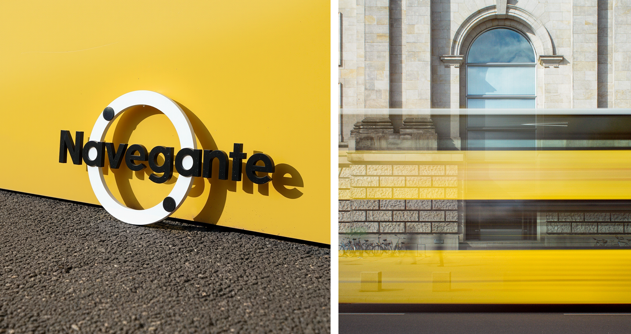
Navegante
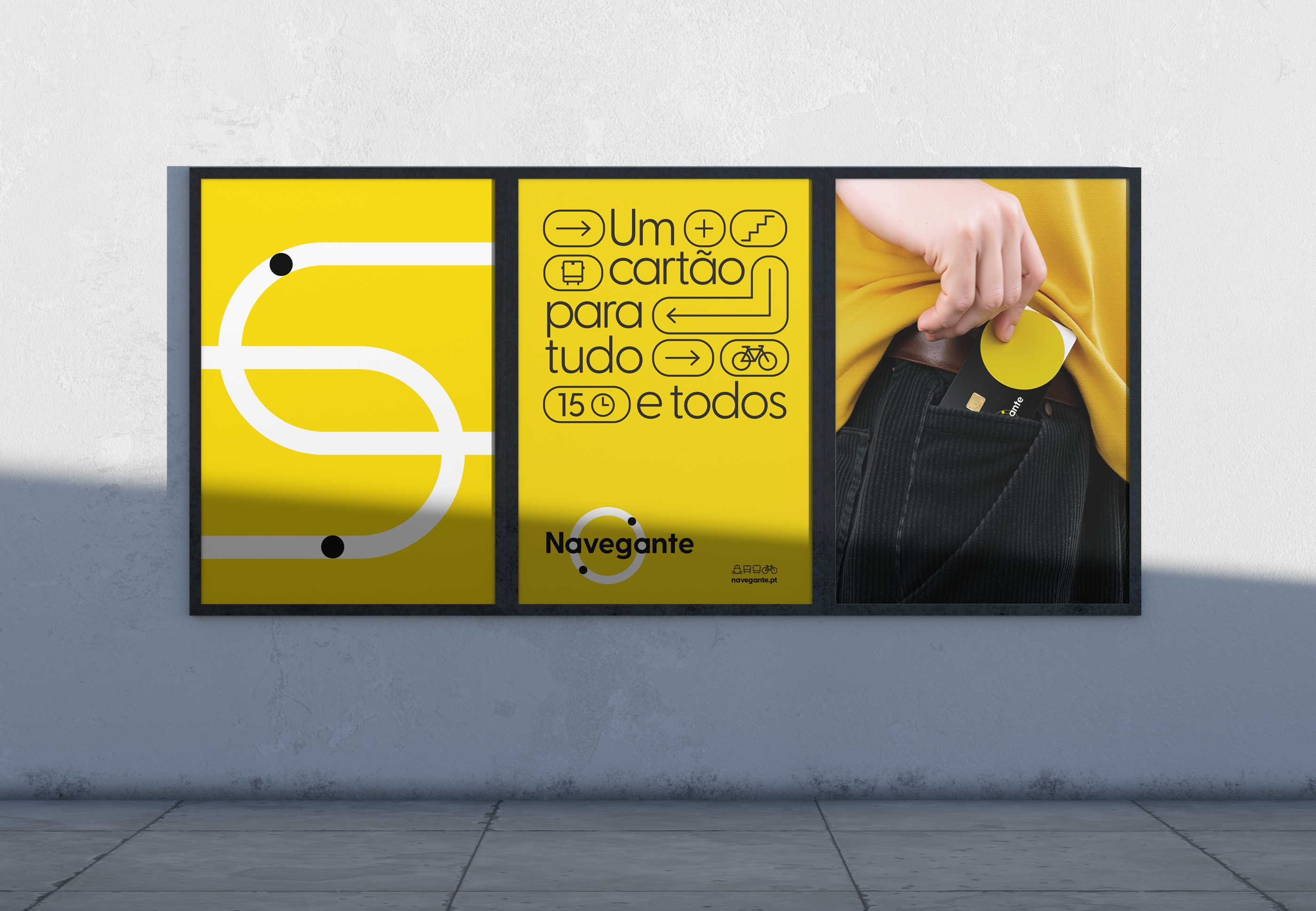
For everyday use or occasional trips, there is a Navegante card for every need and every passenger.
For everyday use or occasional trips, there is a Navegante card for every need and every passenger.
This card connects the entire Lisbon metropolitan area, placing the passenger at the center of the brand.
We were tasked with creating an iconic transport card for the entire Lisbon Metropolitan Area,
one that evolves from the Navegante brand identity, with the circular form as its core conceptual starting point.

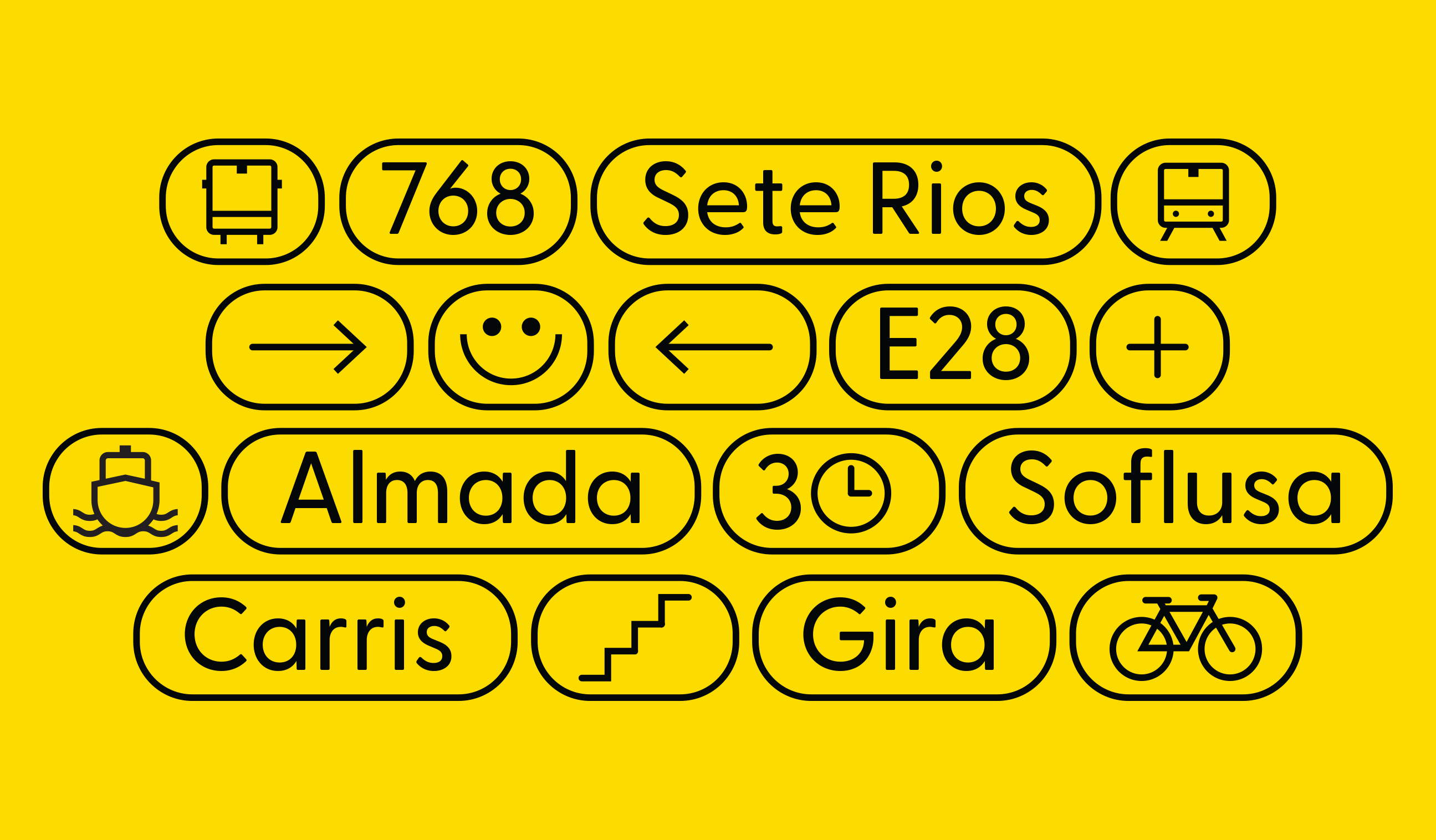
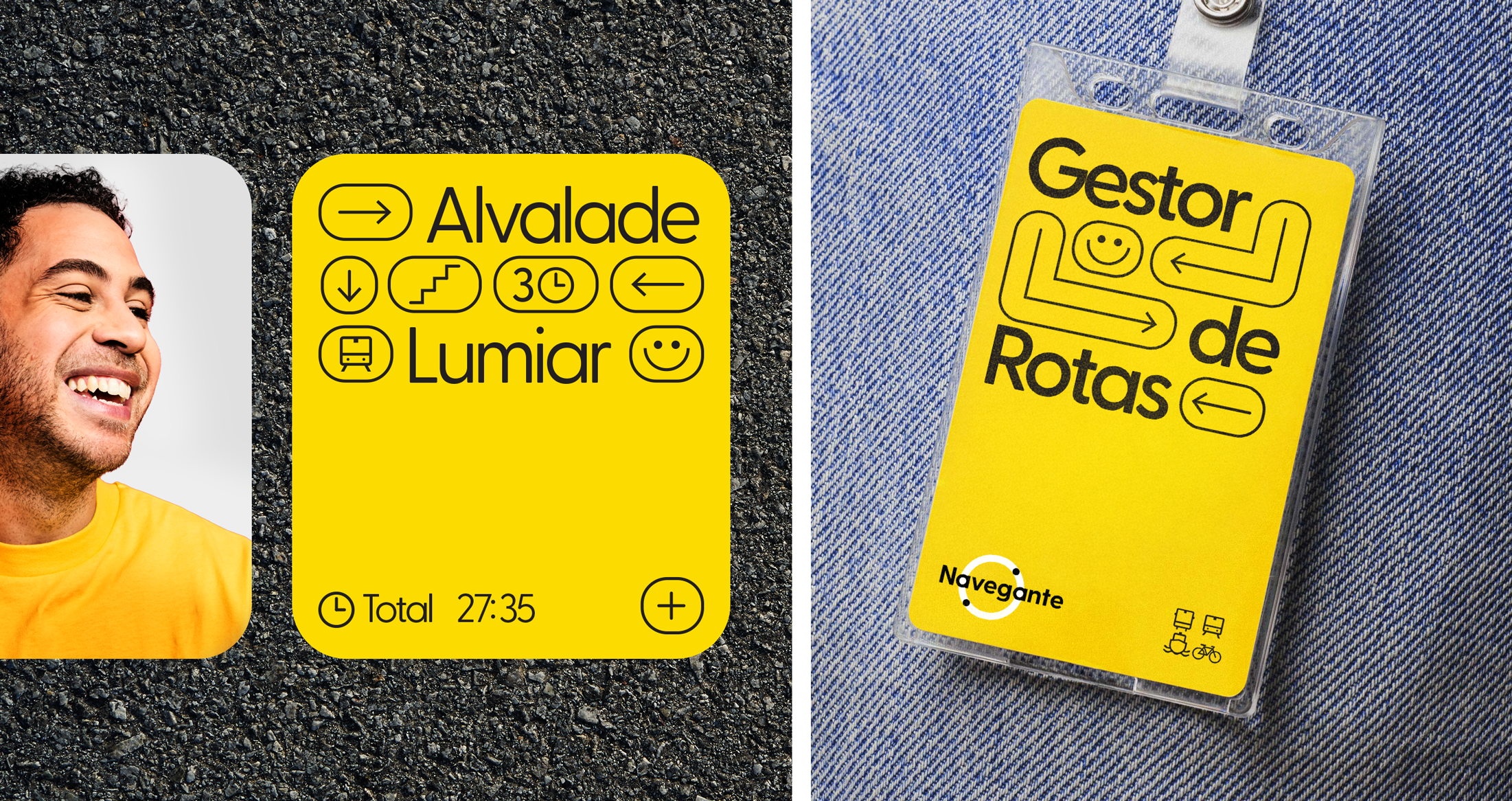
The Dot and the Circle
At the intersection of minimalism and maximum scope
lies our creative vision. The concept is powerful in its
simplicity and resonance: The Dot represents the individual,
the singular passenger, the "self" within a vast mobility network,
a distinct element, yet an integral part of the whole.
Conversely, the Circle symbolizes the infinity of possibilities.
It is the Navegante card, the core of a universe of connections:
unlimited destinations, multiple transports, and the promise
of unrestricted access, all facilitated by a single object.
Less is More. With a target audience spanning from 0 to 99,
the brand demands immediate, clear, and universal communication.
The message must not be lost in complexity; it must be an instant truth.
The Dot connects to the Circle. The passenger connects
to their destination. The brand connects to everyone.


◦ Design _ Nuno Torres
◦ Direção Criativa _ Ricardo Diogo
@ McCann
◦ Direção Criativa _ Ricardo Diogo
@ McCann