Branding
Packaging
Packaging
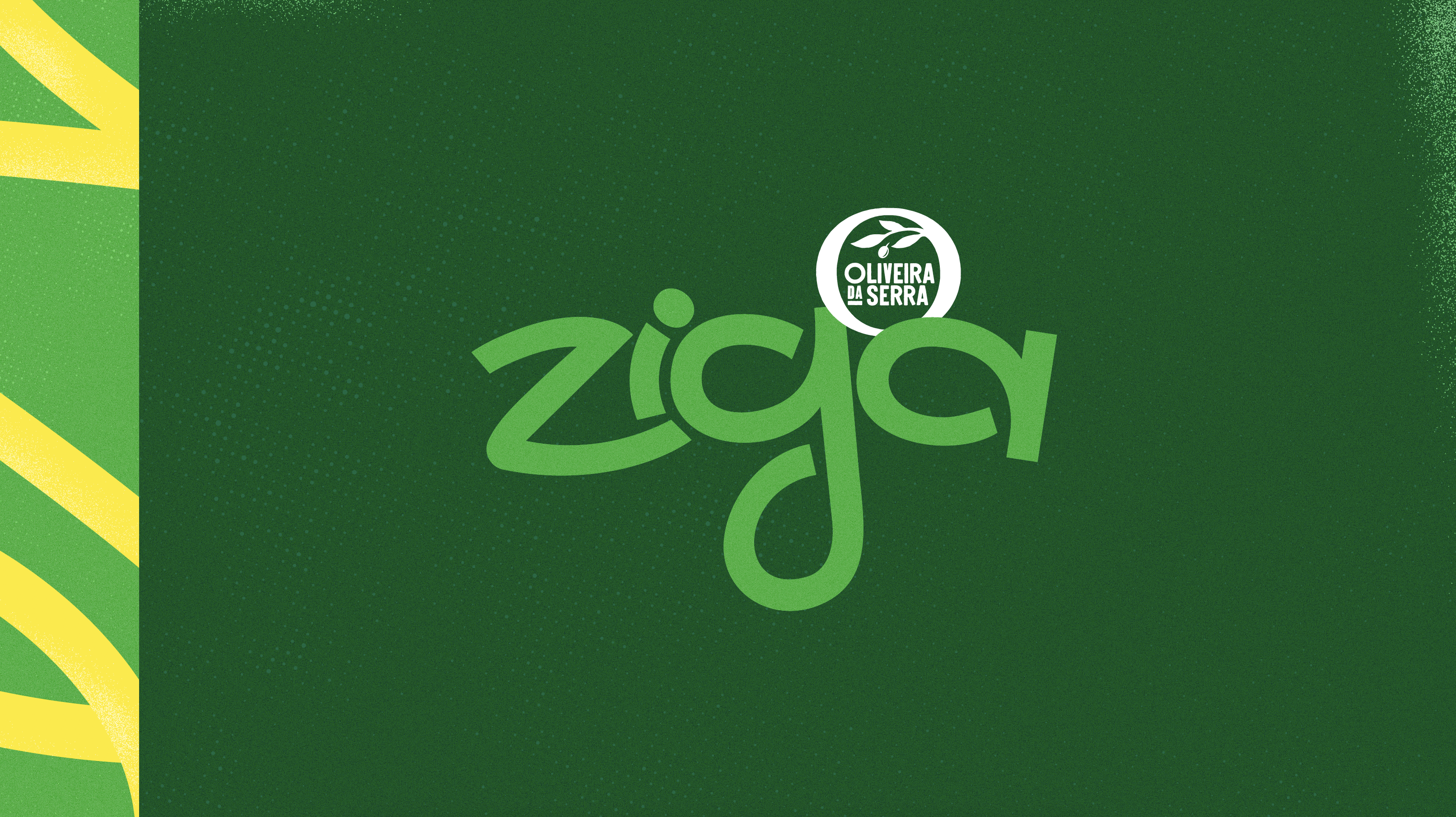
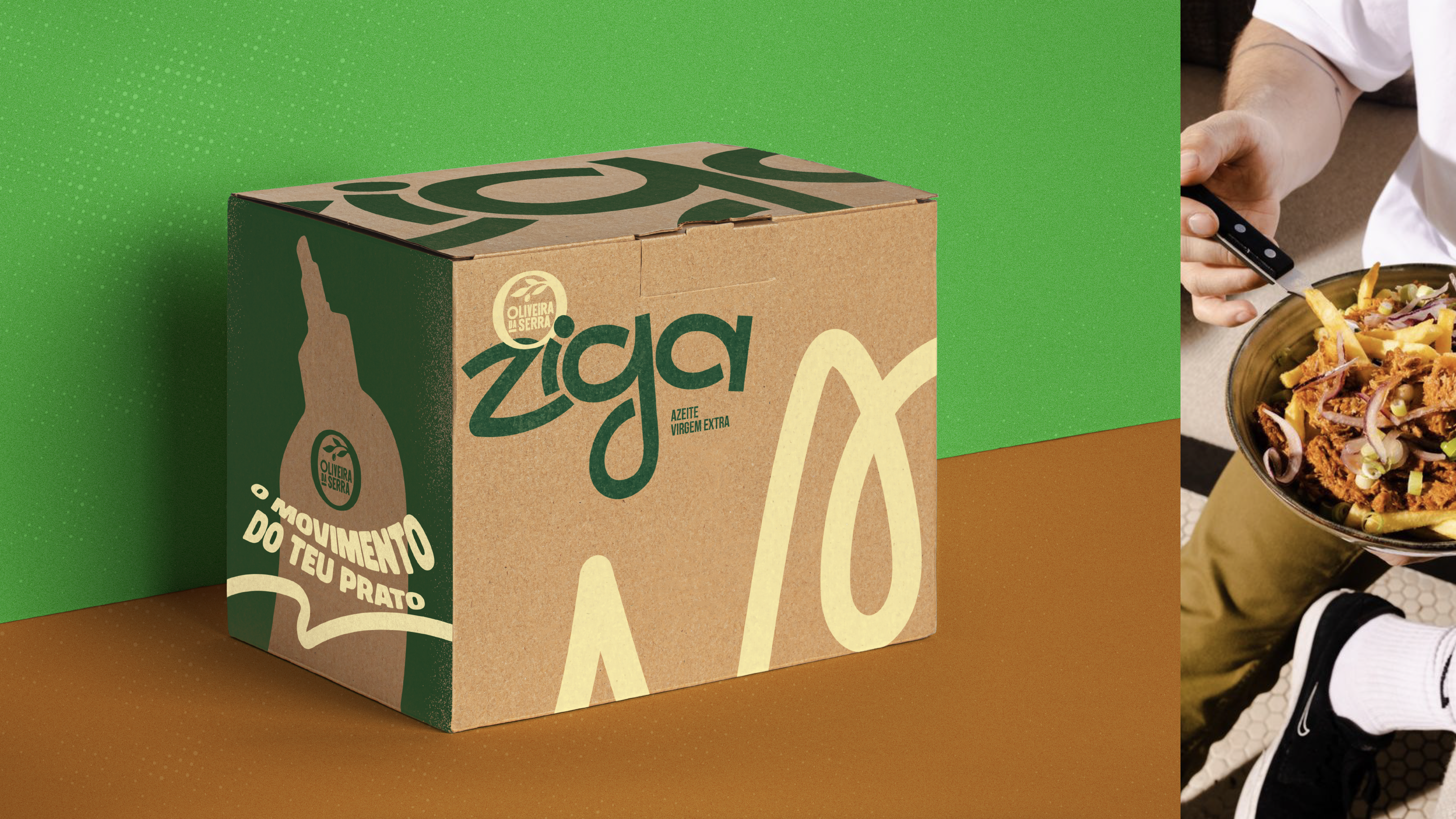
Ziga
by Oliveira da Serra
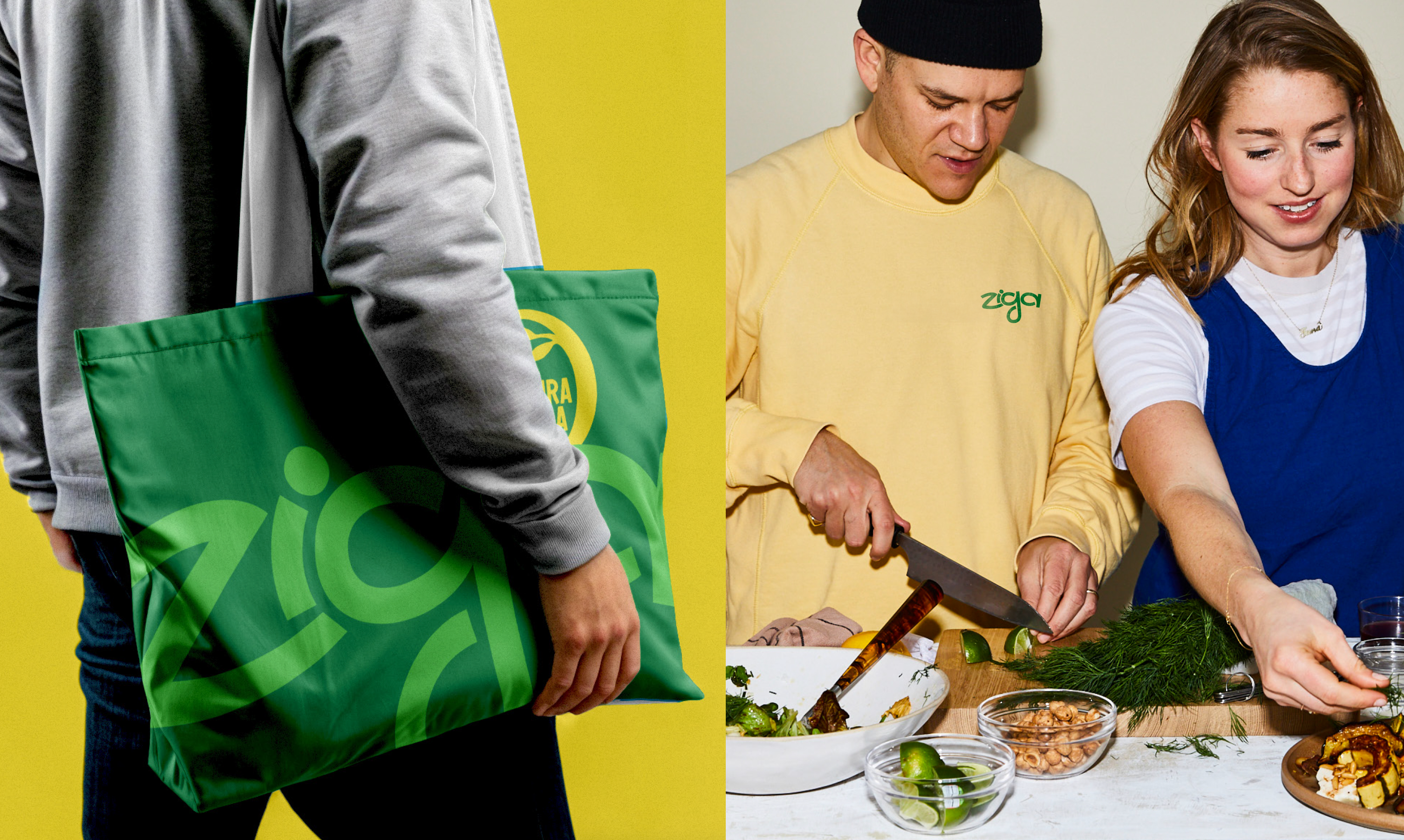
Oliveira da Serra introduces a new product created to connect with a younger generation,
by Oliveira da Serra
Oliveira da Serra introduces a new product created to connect with a younger generation,
one with new habits, new routines, and a more spontaneous relationship with cooking.
In a traditionally conservative market, this launch stands out as a fresh and disruptive proposal,
both in the way olive oil is used and in how it’s presented.
Designed for people who value speed, practicality, and self-expression, this product breaks
away from the idea of precision and formality usually associated with olive oil. Instead,
it offers a more direct, simple, and contemporary experience, one that fits an urban,
creative, always-on lifestyle.


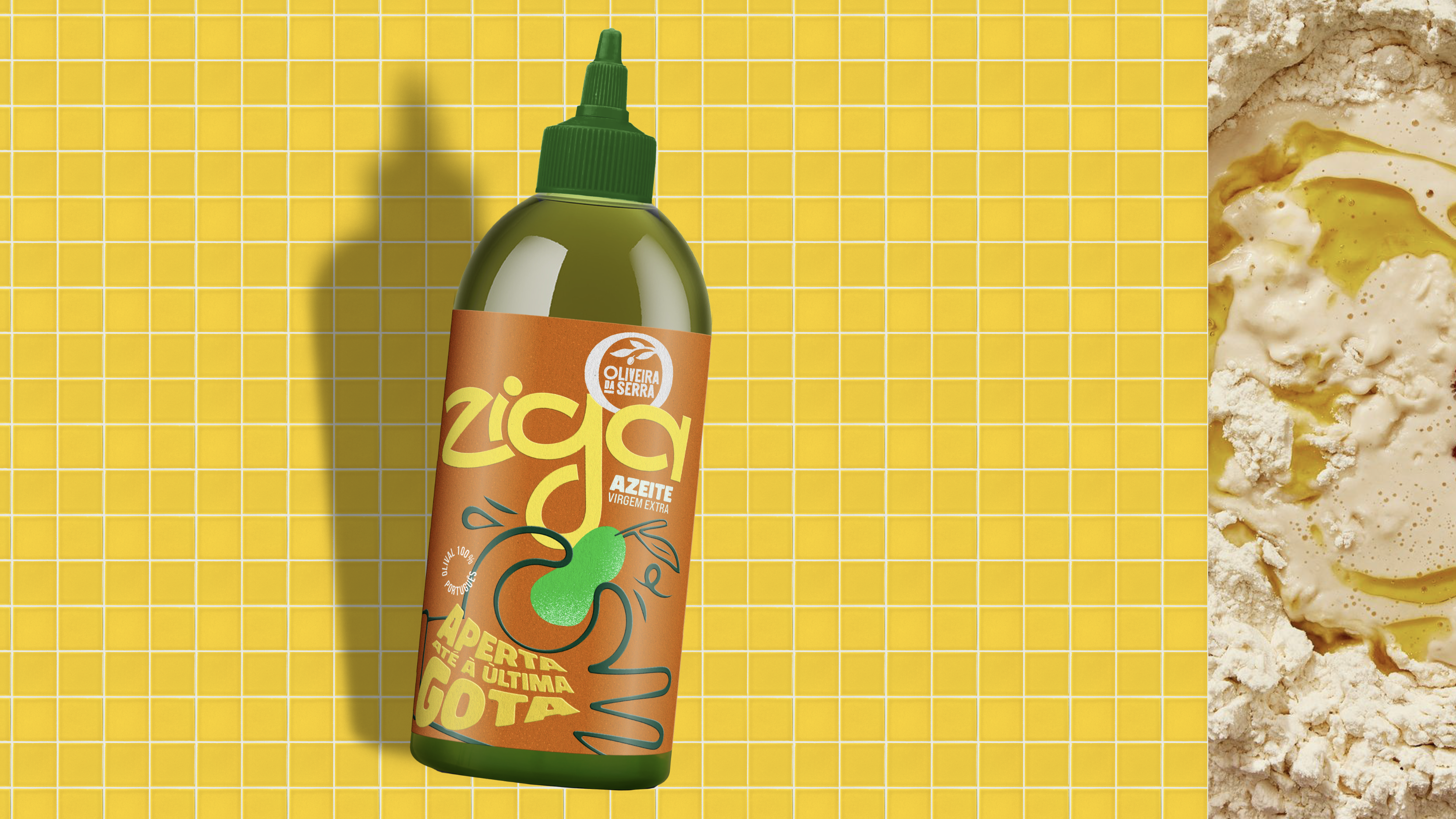
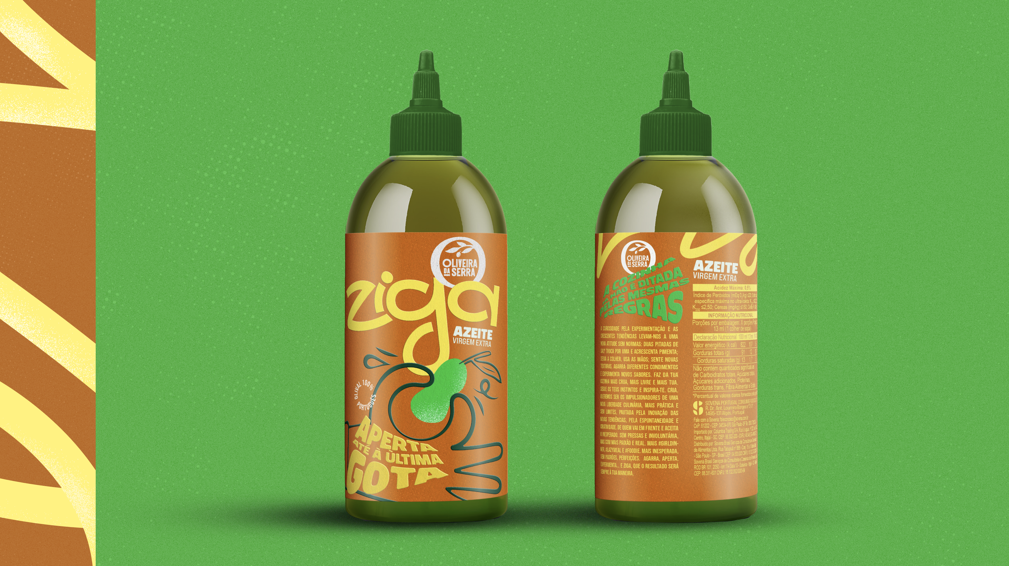
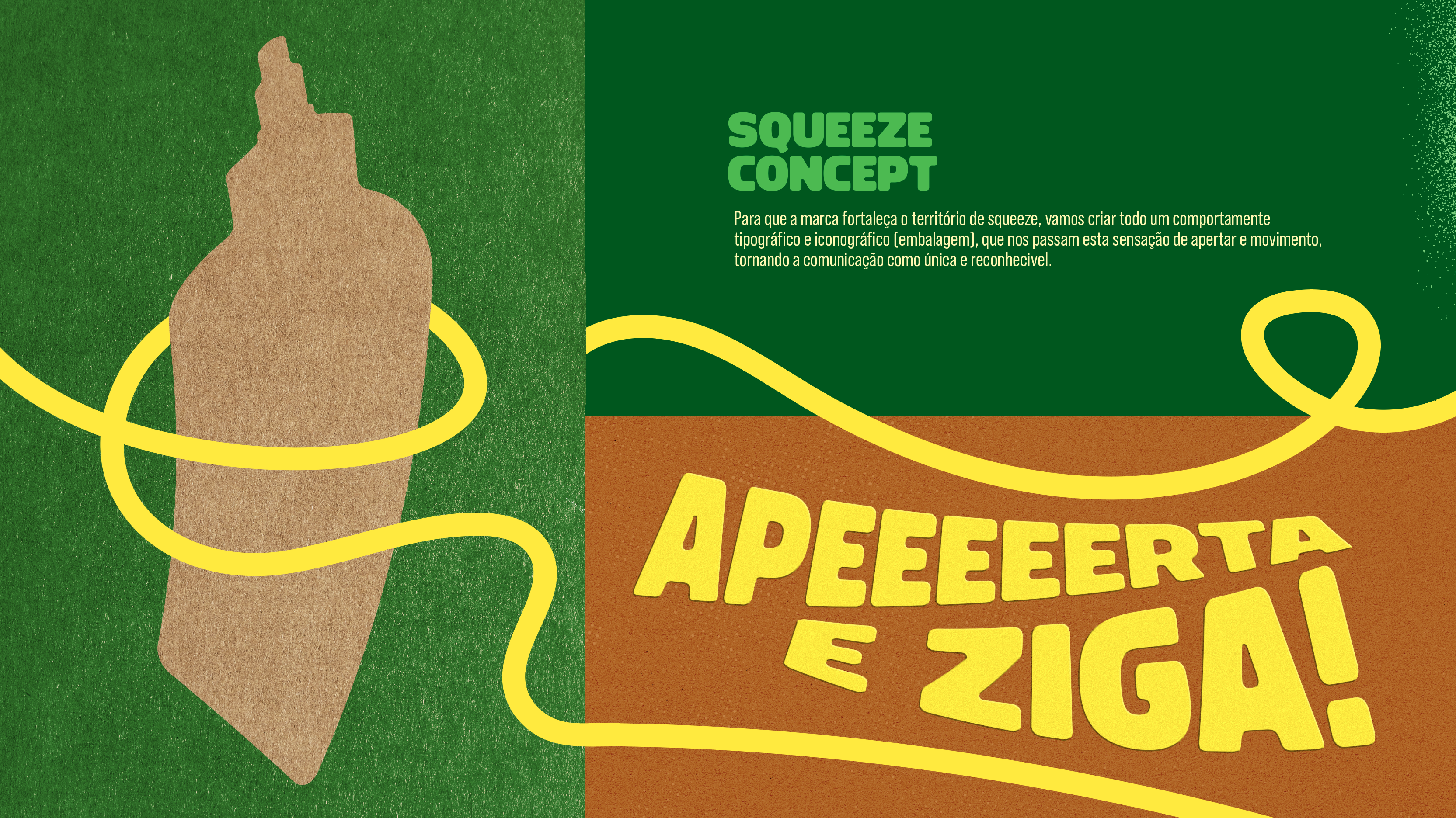
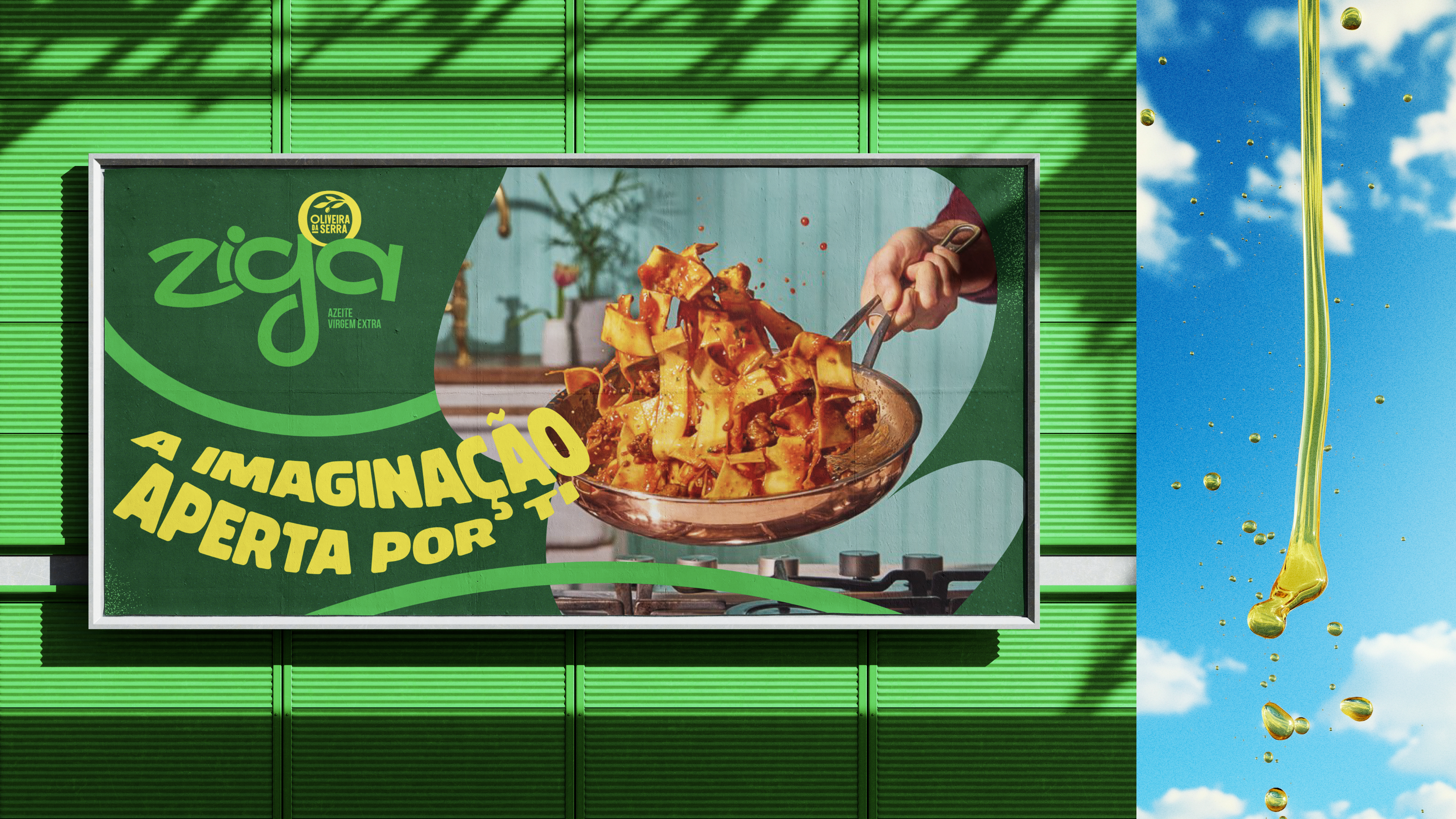
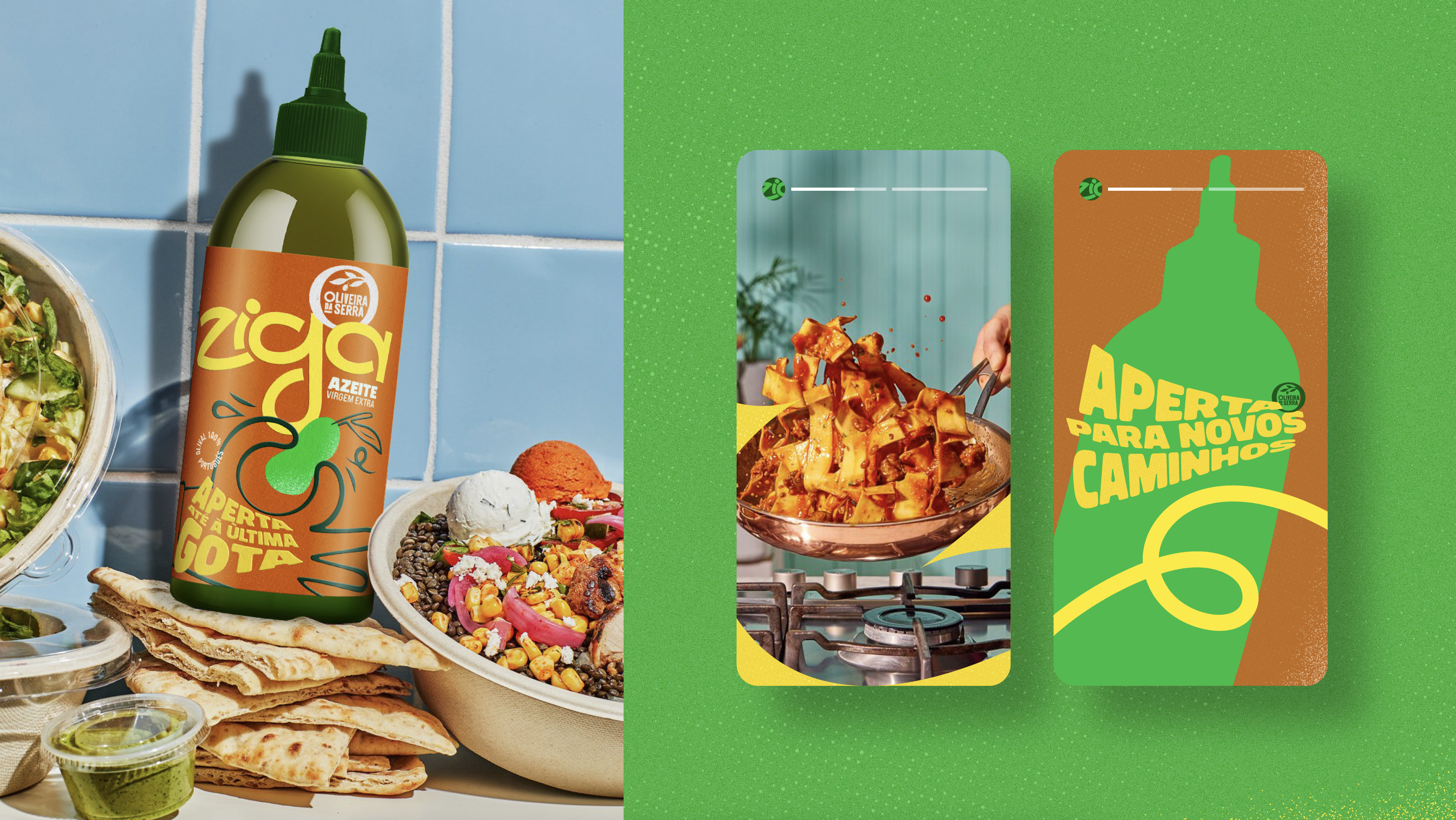
ZIGA is an attitude
It’s about improvising instead of following rules.
About ditching recipes and trusting your gut.
And that mindset runs through the entire proposal. Inspired by the idea
of “squeeze it with your imagination”, we wanted to bring this attitude
into every detail — from typography that feels loose and free in motion,
to the hand squeezing the olive on the packaging, to the bold,
expressive typographic treatment of the headlines.
Beyond the act of squeezing, there’s always this instinctive side,
creative, spontaneous, and unfiltered. ZIGA invites you to squeeze
without hesitation, imagine more, simplify, and explore new possibilities.
Because if you can do things differently… Ziga!
◦ Creative Team _ Nuno Torres, Pedro Rodrigues
◦ Creative Direction _ Ricardo Diogo
@ McCann
◦ Creative Direction _ Ricardo Diogo
@ McCann